 After pping:
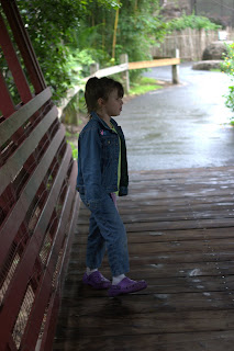
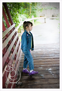
 I am very on the fence about this (ha, no pun intended). It is not the shot I wanted to get. But it still compells me to take another look. I keep thinking it's destined for the recycle bin, but then something about it pulls me back in again. I don't know if I need to just play with cropping in tighter, tilt it a little, or give it up.
 Is this a case of knowing what I iwsh had been, or momma googles? Please let me know your honest opinion. It won't hurt my feelings, promise!
I underexposed this shot originally-and had to adjust in ACR as well as add a screen light layer, defog, and vingette.
All input is greatly appreciated. TFL!
****ETA****
This is what I did.
I increased the exposure in ACR, since I shot RAW I could do this. The camera metered for the much lighter background, instead of the much darker interior. When I increased the exposure, I blew the background- but I wasn't overly concerned about that.
Once open, I ran a defog, around 60-20-0 (that's my base, and if I need to alter from there, I do).
It was still too dark. I created a duplicate background layer, and on that layer I changed the blend mode to screen light. I'm not sure what opacity I left it on. I usually keep it low, @ 18-35%. But this was dark, so I'm not sure what my numbers were.
K's face was still much too dark. So I cheated. I used the lasso, selected her head, and made it it's own layer (control-J). Then I ran screen light layer blend again, with a really low opacity so it would blend in and not be too bright. It is maybe 7-10%.
I used the filter> distort? > lens correction
to create a vignette.
That's my pping.

7 comments:
I really like what you did with this picture. Personally, I think it's a keeper, but I'm still pretty new. I don't know what everything you did to it actually means, but this is what catches my eye.
There's a nice contrast between her and the background, although it does seem a little too bright. And I like the angles, especially the way the side of the bridge draws your eyes in to her.
I hope that helps you at least a little. tfs.
First off I wish i had your PP skills .I am PP challenged. as for CC none from me. I like what you have done with it .Love how it leads out to the path.
I like it but it might be a little to lit in the middle, what did you do in PS?
Definitely an improvement from the orginal. I may try to crop out a little of that really light spot, but the mood you were able to catch makes this that photo you want to keep coming back to. They don't always have to be the technically "correct" ones, in fact...a lot of times, they aren't.
I like the reflection of the water in the first shot, which is blown out in the second one. I would almost like to see the two masked together. I think the picture is a keeper as well.
I think it's a neat shot. I hate when I get shots that keep pulling me back but they aren't what I want. I would play with the crop. I think the other ps works looks good. TFS
From what you started with that's amazing. Your pp work is awesome! It's hard to tell, but are her eyes closed? That's the only thing that bugs me a bit, but you know, you may see some part of her personality in how she is standing or her expression that makes this photo a total keeper!
Post a Comment